I used to think I was pretty good at creating presentations. I took a business communications class in graduate school and learned the same old rules; limit your fonts, three to seven bullet points, don’t read your slides, blah blah blah. I withstood others’ horrible presentations, invisibly smirking and silently mocking the 250 word novels slides with their horrifying color schemes and monotone, stammering presenter. I congratulated myself on not being “that guy.” But the truth is that I was just as guilty of Really Bad PowerPoint as anyone else.
Then I read Presentation Zen by Garr Reynolds and everything changed. My goal in this blog post is nothing short of paying forward that same change, and so I’m using myself as a case study to show what my presentations used to look like, what they look like now, and what I aspire them to be in the future.
But before we go down that road, in case you’re dubious about whether or not really bad PowerPoint is a problem, here is a presentation that Guy Kawasaki put together that was used as the forward to Presentation Zen.
[slideshare id=2857273&doc=guysforeword-100108001635-phpapp02]
The Presenter As Storytellter
The number one lesson I’ve learned is that “slides do not a presentation make.” Rather, they are simply a prop for the story you’re telling. The following slide show contains a series of before and after shots from the same presentation, which I completely overhauled after reading Presentation Zen. They illustrate the first major change; move the narrative off of the slides and into the oratory.
Once the presentation is transformed from a distraction to a storytelling prop, the burden of communication falls on the story itself. Based on the recommendation in Presentation Zen, I also read “Made to Stick: Why Some Ideas Survive And Others Die.” This indispensable book presents six principles that make stories “sticky.” It’s invaluable to crafting messages of all sorts, not just creating presentations. Whether writing an email, composing a blog post, or crafting a memo outlining your thoughts on your organization’s next mission statement this book will help you do it more effectively and memorably. These six principles can be represented by the acronym “SUCCESs”:
- Simplicity
- Unexpectedness
- Concreteness
- Credibility
- Emotions
- Stories
The Presenter As Designer
Duh. That’s the one word that best describes how I felt while reading Presentation Zen. Reynolds eloquently and convincingly makes the case that design is important, poorly understood, and badly implemented (by and large). Those were the “duh” moments, as I realized that those are all true and that I had never realized it or paid much attention previously. But next came salvation, as basic design principles and techniques are presented that make it possible to learn how to improve design. Imagine that – you can actually learn how to design! Looking back, I can’t believe that design wasn’t part of the core curriculum for my engineering degree or any of the computer science tracks I’ve seen. And now that we live in the age of Web 2.0 where we are all content producers, it seems to me that it should be required in all college programs. But I digress.
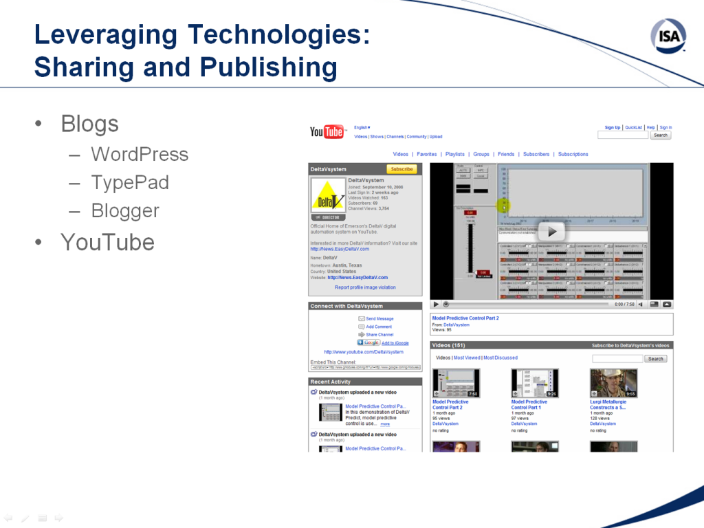
Reynolds begins by stressing simplicity, balance, noise suppression, and space. These are all related and as I look back on my old presentations it seems as though I was deliberately violating as many of these guidelines as possible on every slide. Take the slide shown below, for example. This is not simple at all; there are too many ideas at once and even the screen shot, while appropriate was still complex and distracting. The layout is completely unbalanced and top-heavy. The slide template is noisy with lines and the “ISA” logo implanted in the corner of every slide. Finally, there is a small amount of empty space on the slide, but it is concentrated in one corner and looks more like something is missing. They eye darts around this slide searching for meaning with no help provided from the design.
My personal design renaissance has begun with what Reynolds calls “The Big Four:” contrast, repetition, alignment, and proximity. I’ll now provide examples from my own presentations on how I’ve implemented these principles.
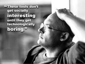
 This slide uses contrast in two different ways. The first is the color contrast between the dark gray background and the pure white text. The words jump off the page in way that bullets never can. The second use of contrast is the emphasis of the words “interesting” and “boring” by changing the font size. For some reason we seem to be afraid to make things BIG enough or bold enough.
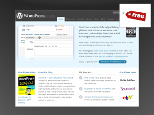
 One of the central themes of this particular presentation was the abundance of free tools available on the Internet in our Web 2.0 world. Therefore, I made use of design repetition by placing the “Free” price tag graphic element on eight consecutive slides in the exact same spot. I also made sure to emphasize this in my delivery by asking the audience to guess how much each solution cost. Of course, the answer was the same and the audio and visual repetition made sure that this point would be driven home. Plus, the audience had fun with it.
 Alignment stresses the importance of making objects appear as if they were placed in a particular place deliberately, rather than simply thrown anywhere there was space available. This slide aligns the letters of an acronym quite deliberately to show their relationship. While this is a good example of alignment, I’m not sure it’s a great example of contrast, balance, or noise. I’m sure there is a better way to present this idea, so I will keep tinkering.
 This title slide demonstrates the use of proximity. The graphic and title are strongly related and so they are grouped together in close proximity. My name, company, and position are also grouped together and separated from the title in order to distinguish and de-emphasize them. You can also see elements of contrast and alignment in play here as well.
The Presenter As Heretic
Alas, as much as I believe all of this makes sense, it remains heresy to create a PowerPoint presentation that does not utilize the prescribed template or can’t be used as a handout. If you look at most of my presentations now, they are completely useless without the presenter and that’s exactly as it should be. Nonetheless, many conferences are still beholden to the same formula of “Email me your presentation three days in advance so that we can print them out.” Adopting this approach means that you need to create your own handouts that contain the substance of your presentation and not just the props. This all takes more work, but it’s worth it for you and your audience. My recommendation is to write the document in Word, then upload it to Scribd (or Posterous or other similar service) so that you can embed it in web pages and blog posts and also increase your online visibility.
Leveraging Social Media & Internet Technology (Handout)
Looking Ahead
While my presentations are a night and day difference from what they used to be, the one thing for certain is that I still have a long way to go. I’m continuing to hone my public speaking skills (which I still think are not very good) and currently enjoying “Confessions of a Public Speaker” by Scott Berkun. I’m simultaneously thumbing through Nacy Duarte’s “Slide:ology,” which is not merely informative; it is incredibly beautiful, mesmerizing, and inspirational. I now look upon each public speaking engagement with excitement and optimism of not merely meeting the challenge, but improving each and every time. I’m looking for an end result that comes close to something like this…
Photo credits:
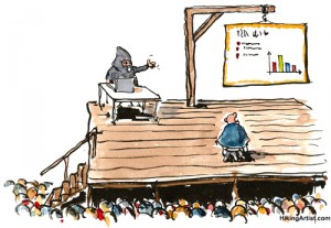
“death-by-presentation” from HikingArtist.com on Flickr (Creative Commons)

